If you showcase your game on conventions – you know how important it is to hold the attention of the user and make his experience playing the game trouble-free. The way people play your game during the event actually allows you to witness how people are going to play the game at home. This opens up a path to gather real-time feedback and, of course, improve the on-boarding process for the game. You can also miss some potential fans if your game does not look appealing or understandable in the first minute.
A bit of a backstory for context: The last 4 months of my life I’ve been spending all my spare time to develop the game with a working name “Lazy Galaxy.” It’s a game where you control an evil (albeit lazy) alien race and try to conquer the universe. It’s an experimental mix between RTS and clicker/incremental game: you build a base, then you send ships to space. The ships can be controlled as in RTS games, but this is not necessary. Since I’ve never seen something like that anywhere before (let me know if you have, I want to play this game!) – there’s a challenge of introducing players to this sort of game.
This might seem like a very specific case, but I’ve learned a lot of stuff that is going to be useful for a lot of games. Over the last two months, I’ve spent a considerable development effort to ease up the introduction into the game. Here’s how it went:
Experiment 1: Text Tutorials, Smaller Convention
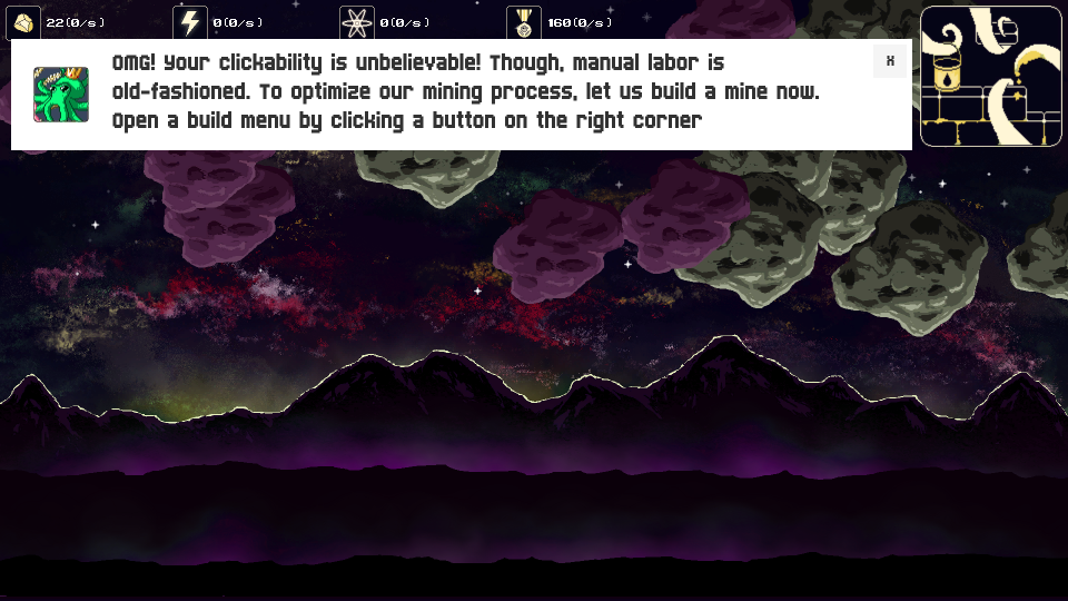
I’ve actually found out that I’m going to an expo only two weeks before. The game seemed complex due to worse state of the ui in early stages of development. We knew that nobody reads texts – but how bad can it actually get? We’ve drawn cute mascot portraits, made the tutorials fit the narrative and made “bouncing buttons” that highlighted where the player should be clicking. We also made UI elements appear as the game progressed, instead of throwing everything at once.
Needless to say: I think only three or four people read the texts. Most people left in the first minute of the game. That’s understandable. Next time you are at a convention, try looking for an unknown games with average amounts of text explanations and play them. Are you capable of going through all instructions? I think the whole event atmosphere creates a “rush” feeling, because there are plenty of things happening around you. The event escalates the dislike for text tutorials, because no one wants to sit in one place, hindered by walls of text, unbeknownst about what are they going to get in the end.
Players also often missed our bouncing button cues, even though I’ve made all parts of the UI appear after the relevant feature becomes necessary.
Five people left their emails at the end of the day: two of them were friendly developers. Only the remaining three of these were actually people that enjoyed the game and wanted to know more.
Experiment 2: Pictures instead of text. Propaganda posters. Arrows that show where to click.
For the next convention, GameOn, biggest game convention in the baltic states, we understood that we needed a much better preparation. I’ve spent two weeks trying to figure out the best way to present information.
The first one to get added was the floating cursor helper. It showed where player needed to click, so the game would be accessible even to the players who don’t know english.
The next one to go were the text: most of the texts were thrown away. Only a simple reminder of what needs to be done (i.e. gather 20 minerals). It blinked for the first two seconds to indicate that the task has changed.
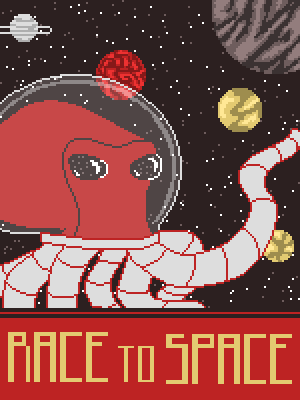
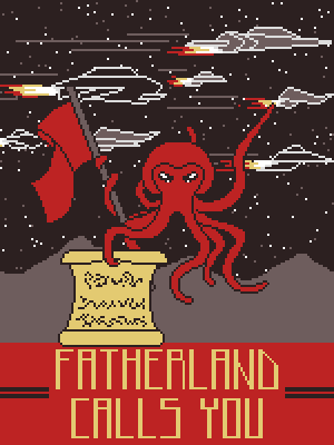
Another idea was to replace the texts with iconic images, to show how the game operates and what needs to be done. To avoid making it look like a chore, we’ve added some sort of a “propaganda” posters to the right side of instruction images. Those were designed as a references to the real-world propaganda posters. The idea was to make a game-world feel a bit more alive and add some lore. Feeling that this should do the trick, we went to the convention with high hopes.
Success?
Actually, only partially. Twenty five interested people left their emails. Not that much, but the results are much more successful than the previous ones: we genuinely found people who were interested in the game, but I’ve noticed that I often had to step-in and explain the core principles that I want to do. In convention, it might be OK, because people actually want to communicate with the developers directly and essentially you are the one “selling” you game idea. But imagine if they were playing my game at home? Nobody would be there to say “Hey, you can actually upgrade your buildings to increase an income.”
Here are the issues:
1) While the players stayed at the game much longer, the tutorial was unable to explain the principles of the game. The players heavily relied on the arrow pointer to show what to do. They progressed through the game, but only because the game explicitly told them what to do. They could not utilize the mechanics as those were introduced: a lot of players missed the concept of building upgrades, how those increased the flow of resources and made the gathering much easier. This is not their fault, but the fault of such design. From now on I understand that arrow/clicking tips have their place to be and are effective at directing players, but should be used with caution. The trade-off: players are able to progress, but unable to learn how to use the tools the game gives them to find solutions to their problems.
2) The images with propaganda posters / instructions got closed as annoying pop-ups. There was not much difference with text popups, although they did attract some initial attention. In the end, this did not prove to be a dependable solution. The small tasks were OK though, and people often look at them.
3) Another thing that affected the first one: the tasks were telling player what actions do they need to do instead of giving them the goals they need to achieve.
Next Steps, Solutions?
Think about the following objectives and which ones sound better:
3.1) “Build a mine” or “Establish Metal supply”
3.2) “Click on 20 asteroids to gain 20 metal” or “Gain 20 metal to start building a base”
3.3) “Research Space Travel” or “Go To Space”
I’m sure you can find out the similar action vs goal-oriented tasks in your game. After witnessing the results of the first option, the second option seems like the better choice. It needs more visual cues, but this gives players the goals they need to reach instead the actions they need to take. Instead of chewing your food in their place, you give them the opportunity to taste it. Give the opportunity to explore and experience your game, instead of letting them feel constrained.
Here’s what I’m trying to do now: the game is going to have a special “Codex,” a dictionary with lore and it’s going to have a special chapter. There is going to be an article for each one of those instructions (that essentially contains the scheme + propaganda poster). I’m not going to show the propaganda posters right away, the “?” button will appear next to a current objective and when player click it in case he needs help.
The leading mouse pointer goes away for most cases. It is going to be replaced by element outlines / slight shaking that will appear after some time if player struggles to complete his objective.
The small objective window is going to stay. The objectives are going to be task-focused instead of action-focused. Example: instead of “Upgrade Solar Panel,” there’s going to be “Get your total energy income to 2 per second.” Essentially, allow the player to find his own solutions and feel great about this. The “feel great” part will need more work: visual cues need to be subtle, instead of “In your face, doing everything instead of you.” Hopefully, this will have better results next time.
What would you do? What do you think could work in this case?
EDIT: In case anyone is wondering, here’s how the gameplay looks (explained by yours truly)


